A New Logo and Custom Web Design for Talos InfoSec
Another website created by FirmDesign has gone live! The cyber security consulting firm, Talos InfoSec, has launched their site and is ready for ...
We found an awesome article from ConversionXL which got us thinking about how to design e-commerce flow. We wanted to do a write-up and offer a review of that ConversionXL post in addition to some online-buying statistics.
The marketplace has evolved from real-life stores inside shopping malls to online inventories available in our own pockets. Retail companies have been pushed to understand this shift in shopping behavior and have needed to evolve themselves. As a part of this adaptation, those who are doing web sales must address this question: how can my website maximize checkout flow and optimize the experience so that individuals follow through and complete purchases from the payment page?
This question is an even more important question to consider in light of what is called "The Great Retail Demassification" and the buying behavior of Millennials. Think about this:
Keeping these statistics in mind, the importance of web companies maximizing e-commerce checkout flow becomes clearer and when considering optimization of the online buying experience, we must also keep in mind the audience: humans. The Persuasive Tech Lab at Stanford has developed a framework for human online-buying behavior, the Fogg Behavior Model. The basic message of this model is:
behavior = motivation x ability x trigger
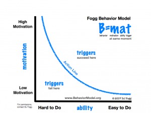
The sweet spot falls in the top right corner, on the point where high motivation is matched with being easy to do and a trigger being in place. Think about Amazon and how they have mastered the motivation + trigger within their product promotion and present a trigger in the “Add to Cart” button. The ability feature focuses on making it easy to complete checkout. Let’s look at some ways to make the checkout flow easy and seamless.
First, the sign-up process. Don’t force registration because this ultimately hurts conversion. Making the buyer register and create an account doesn’t necessarily manufacture loyalty - think about how many websites you’ve given your email to and what feelings of loyalty and warm and fuzziness you have towards them. Always offer a guest checkout option, but phrase it differently, something like “New Customer” instead. Another option is to offer account creation on the “Thank You” page after payment. This way we’ve already got them through the purchasing process, as well as gathered most of the information needed. All that is left to enter is a password and an account is painlessly created in one or two clicks. Just remember if you had to choose, which is most important: more account registrations or more purchases?
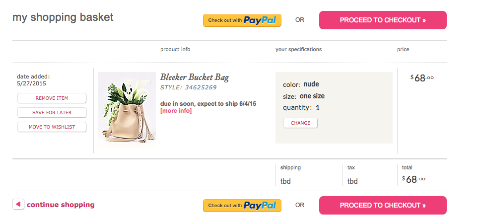
Second, the shopping cart. It needs to be ridiculously clear when a new item is added to the cart. This can be done either by displaying confirmation on the same page or by transferring to the cart page. The benefit of staying on the same page is that the person didn’t ask to move to a new page, so there are no surprises. However, it may be more helpful for you if they could see something else they might want to buy. Transferring the person to a new cart page takes them closer to the payment page, but it may mean losing out on more items per cart. Keep in mind that we don’t merely want to increase the number of transactions but also want to increase the amount spent. Quality must be considered in addition to quantity. The key features to focus on in the display of cart contents are clarity and control.
Clarity = easy + obvious. Make sure there are no surprise costs because they can lead to the person abandoning her cart.
Control = easy to make changes. The display also needs to utilize a visual hierarchy, making use of the well-placed “Continue to Checkout” button. It is a good idea to include two of these.
freepeople provides a good example of this visual hierarchy:
Don’t make coupon or promo code fields prominent. These can make the buyer feel less important for not having one and many resort to Google to find a coupon code. It's important to note that we don’t want for the people to feel like they should have a coupon code, it can lead to them taking too many steps away from the site, which leads to abandoning their carts. Remind them of the good things like shipping, returns, and security!
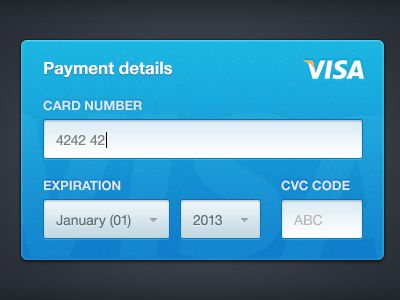
As for the checkout process, in addition to making it actually secure by using a SSL, make it look secure as well. Ask for credit card information last. It’s the most difficult info for the buyer to fill out so follow an easier 1-2-3 step flow: name, shipping address, card information followed by billing address information (with a checkbox for same as shipping).
A skeuomorphic design for the input of credit card information is also a nice real-life touch. Design the input field for the card number to look more like an actual credit card:
It can also be quite useful to store the credit card information. This requires PCI compliance, but also promises more money from returning users. By remembering the buyer’s information, we can remove some friction for them and make buying a one-click activity.
And of course at the end of each step, be sure to make the next step very specific. Control, clarity, motivation, ease of ability, triggers, security, and intuitive interfacing are key constituents of e-commerce flow. If your website can maximize this flow, then you can maximize the gains to be made from online shoppers. FirmDesign builds and designs easy-to-use e-commerce programs for websites to help your online purchases flow seamlessly. Be sure to call or email us so that we can assist you with any of your e-commerce needs!